Typography can hold a lot of power within a design and can be an excellent use of an expression. The possibilities are endless, whether it's one word, a poster quote, or a simple monogram.
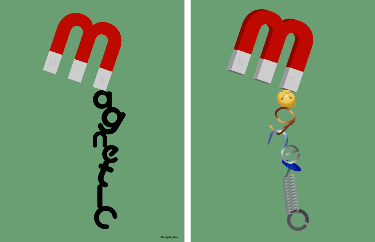
For this illustration I used a typeface that looked magnetized to create the illusion of hanging. I then created images of items that would resemble the letters.
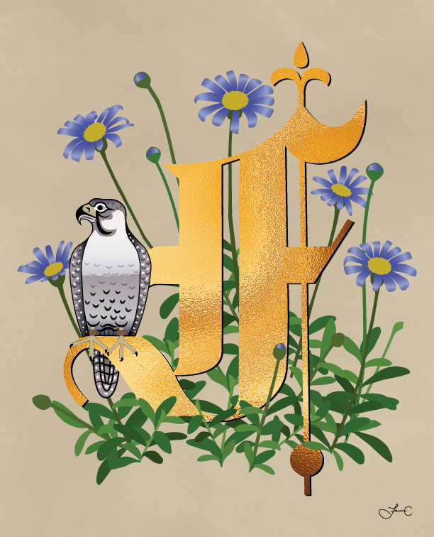
I really love the look of the medieval illuminated manuscripts with the foliage and animals. For this look I used the typeface Old English. I created a gold leaf image in Photoshop and used a clipping mask on my typeface image. The falcon was to resemble a velum drawing from the medieval times.
For this poster illustration I drew my own typeface.
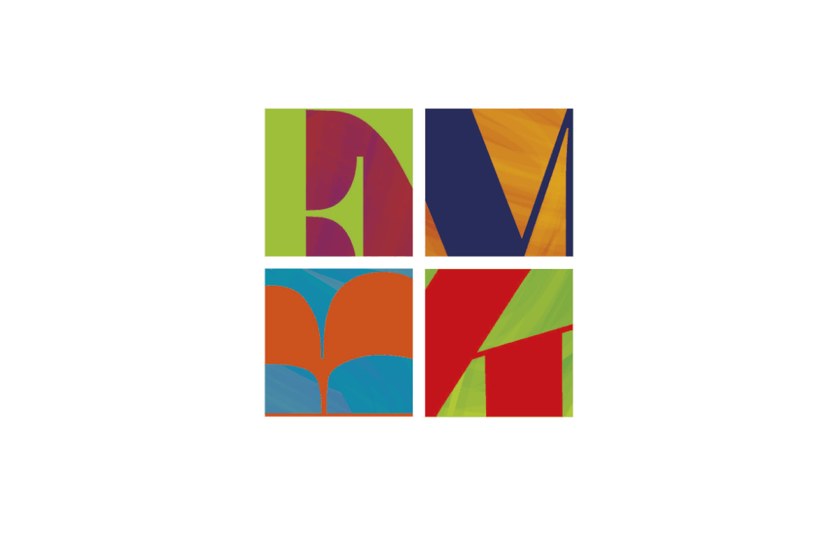
This cropped letter grid was designed to highlight the shapes and parts of typeface in specific fonts to become a cohesive and unified design.
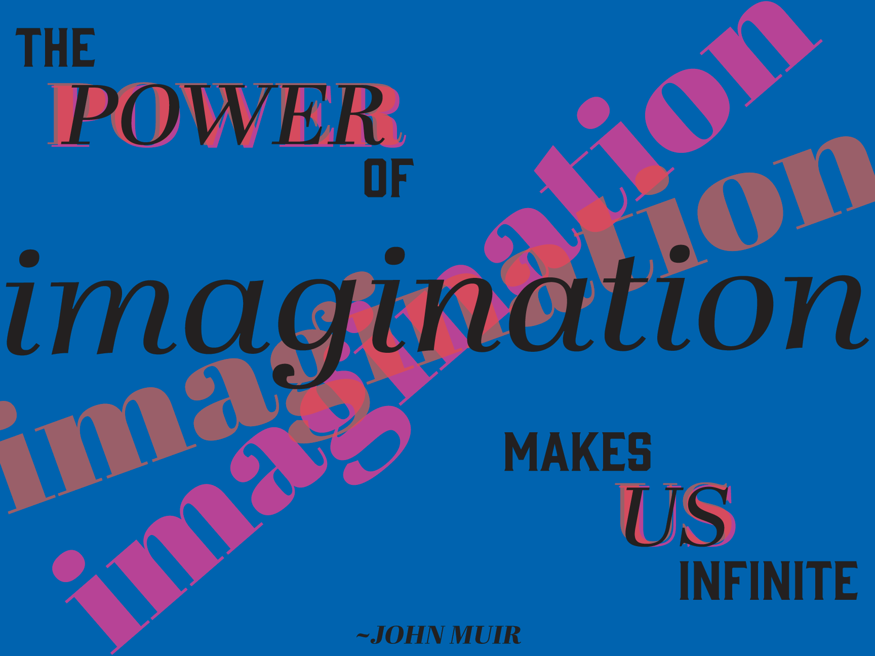
I was to design a poster that had the same quote for two different groups. This poster has a brighter color palette to show the energy of a high school environment. The use of bright colors and off centered typography makes it visually very fun.
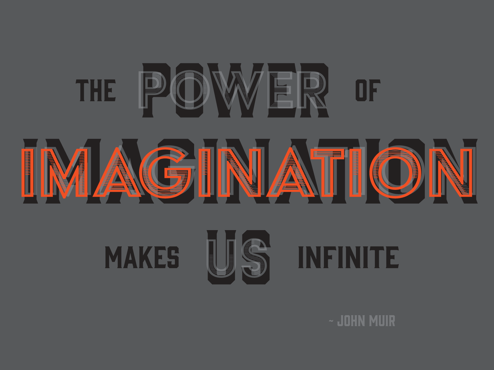
This poster was designed for a Fortune 500 corporation. Same quote, but the use of a muted color palette, with a splash of color and a different typeface, shows how drastic a design can be when laid out differently.
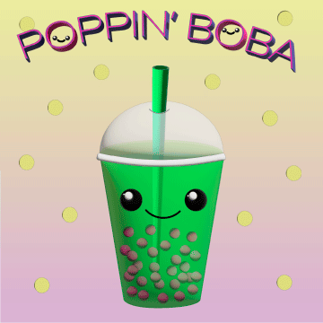
This sans serif typeface has a fun and bubbly feel. It works well with creating little smiling boba’s within the name.
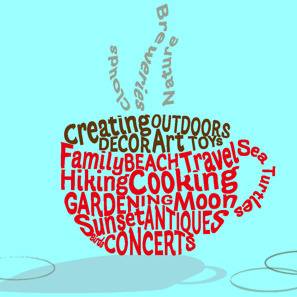
The use of words within a design can create an image, with an addition of coffee stains for an added texture.
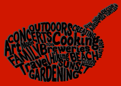
The same words and typeface were used in this image, but feels different with a drop shadow and red background.
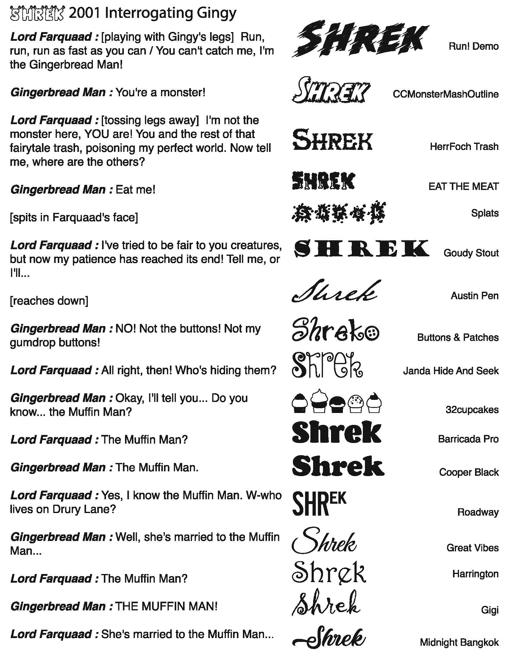
This is a funny skit from the movie Shrek. All of the typefaces were based on the tone being spoken or the character that is being discussed.
Back to Top