Logos are an expression of a company, a brand and most importantly this icon is your business. A million styles, colors, typefaces, and techniques are used in creating a logo. When all of these come together as a design, it can become everything that you are as a business.
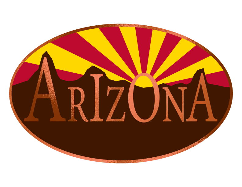
This has a metallic copper overlay adding interest to the mountainous Arizona below the state flag sunset.
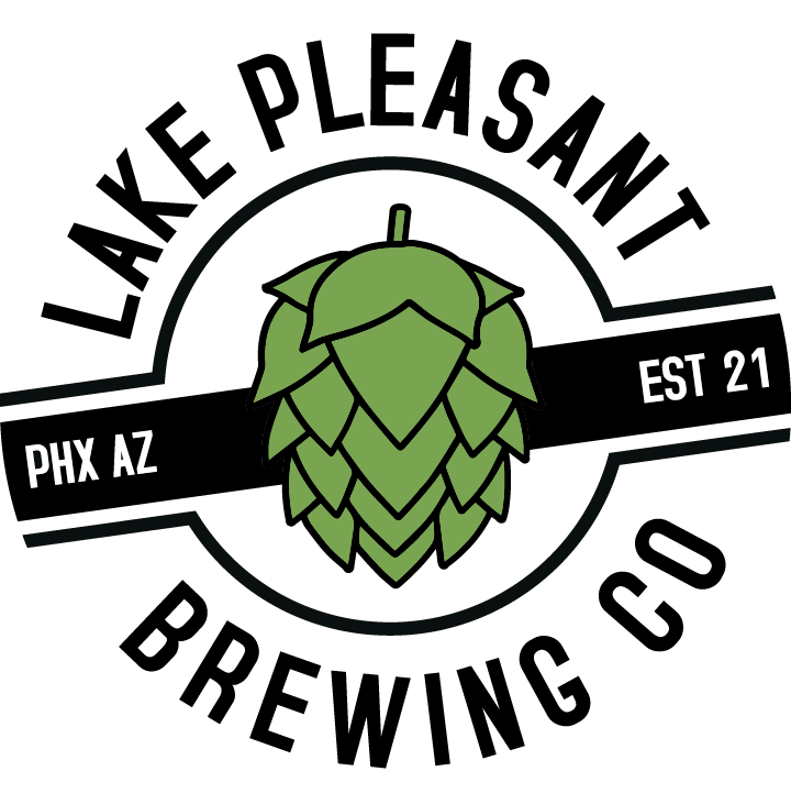
This emblem logo makes a point of being a brewery by having a large hop in the center.
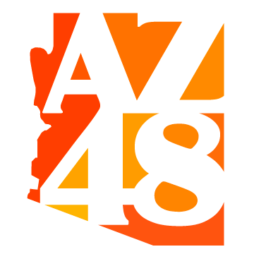
State 48 is a big deal right now in Arizona. The use of a orange copper color radiating through the state, gives the feeling of warmth, or just extra sunshine.
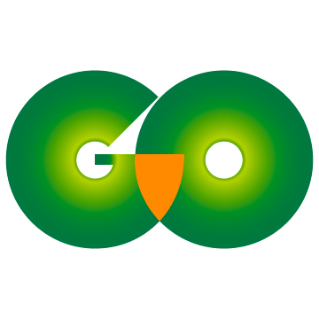
GO is a wilderness logo, made to look as though an owl is peering at you.
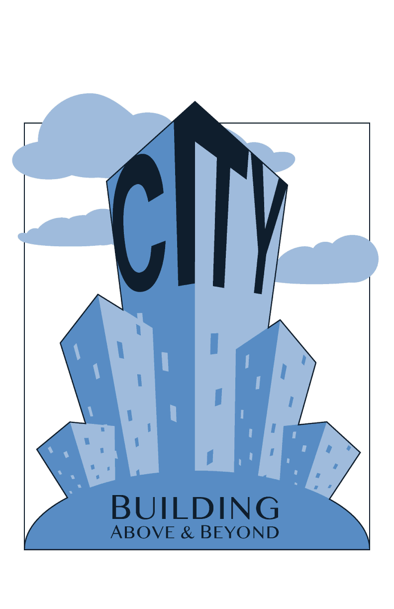
City is a commercial construction company. The design was to have a skyscraper, clouds and the company name within the logo.

This logo shows movement with the arrows going around and through the word GO.
A typeface in serif is used to make a ligatures logo.
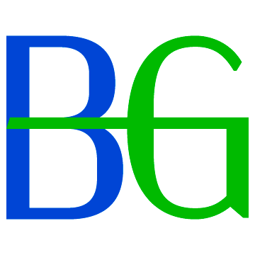
This ligature monogram logo has movement with the "G'' arm reaching across from the "B".
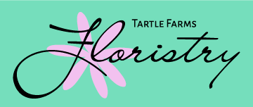
A typographic logo with a sans serif and script typeface adds contrast, while the flower is created using the “L” from Floristry.
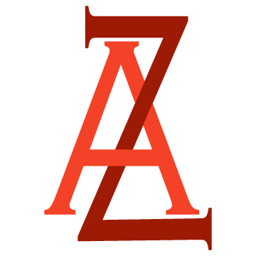
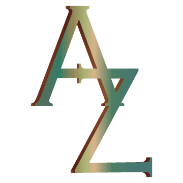
An inerwoven "Z' adds depth.
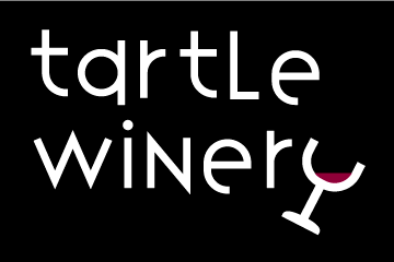
A modern winery logo for a more youthful crowd, was achieved by using a monochromatic color scheme, creating a wine glass with a “Y” and tilting it as though it is being sipped.
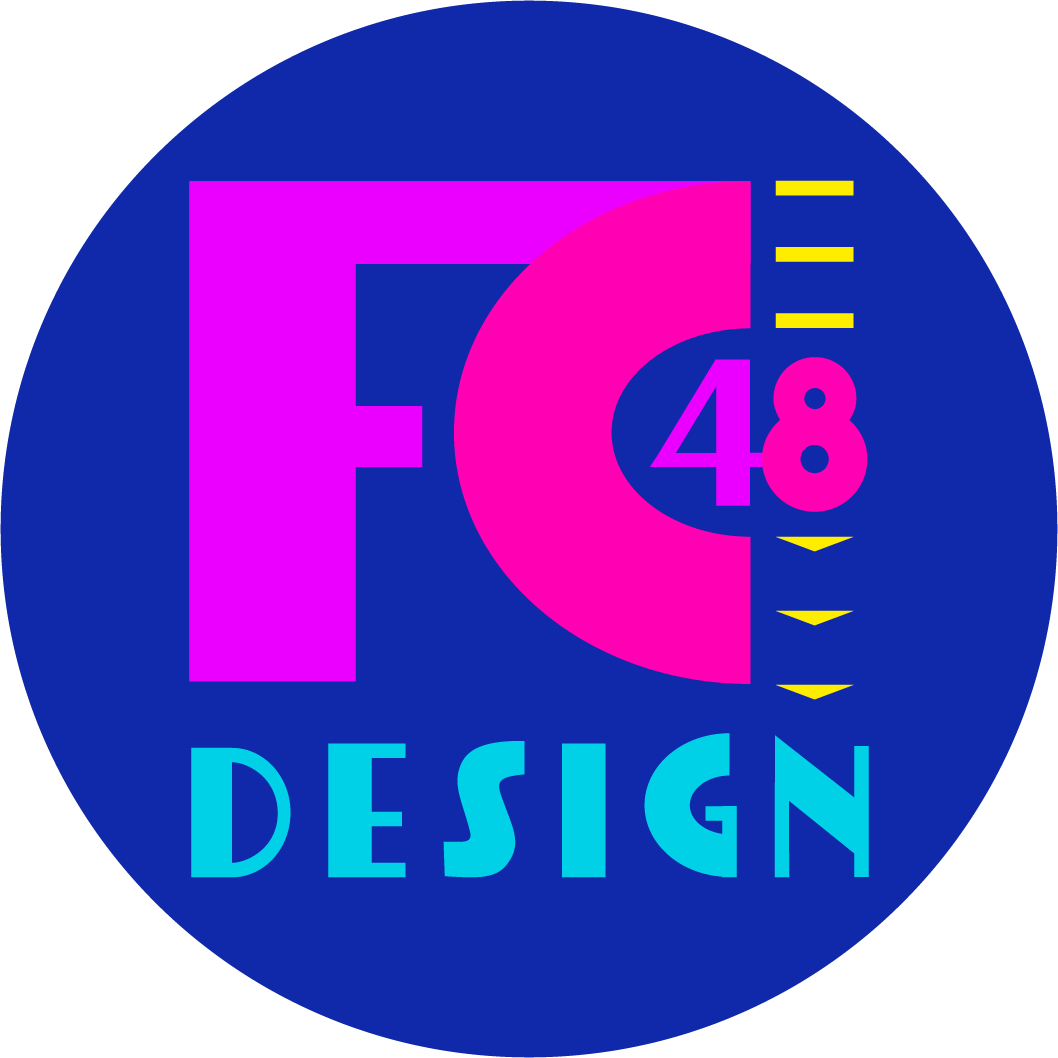
This logo has an 80’s Art Deco feel. The visual interest is the 48 hanging off the FC, with the shapes leading you down to the word design.